How might we make Google Docs the single best option for writing, editing, & collaborating on mobile devices?
Overview
For this project we were provided with a brief to re-design Google Docs as the single best option for writing, editing, and collaborating on mobile devices as Docs’ primary pain point is its mobile experience.
My Role
On this collaborative project, I took on the roles of UX Researcher, UX Designer, Interaction Designer, and Product Designer.
Team: Charlotte, David, Julie, Heidi
UX Techniques Used: Heuristics Evaluation, Competitive/Comparative Analysis, Affinity Mapping, User Personas, Task Analysis, Task Flows, User Flows, Wireframing, Prototyping, Usability Testing
Materials: Online Cards/ Optimal Cardsorting, Online Sticky Notes/ Miro, Pen, Paper, Figma
Timeline: 2 Week Sprint
Deliverables
Research: User Interviews, Competitive & Comparative Analysis
Synthesis: Digital Personas, Problem and Solution Statements, Task Flows, User Flows
Ideation: Sketches, Mid-Fidelity Wireframes
Testing: Prototype, Usability Testing
Presentation: Next Steps, Slide Deck
Challenge
Currently, Google Docs is losing its mobile market share to sleeker apps like Notion or built-in Note apps simply because the experience is smoother, faster, and more familiar.
Research
I started the design process by engaging in 5 forms of research:
Understanding the Current Product and Existing Features
For this project, we had to consider Google Docs place in a larger connected ecosystem of shared files. And refocus visibility to key functions while mirroring the desktop experience to become the go-to way of taking notes and editing documents on the move.
1. Heuristics Evaluation
To understand the issue at hand more in depth, we conducted a heuristics evaluation of the Google Docs Mobile App where we noted issues with user control and freedom, consistency, and visibility.
Heuristic Evaluation Growth Opportunities
-
33%
Flexibility of Use
-
23%
Consistency & Standards
-
13%
Visibility of Status
2. User Interviews
We then embarked on User Research and conducted 5 User Interviews and Task Analysis by testing the current design of Google Docs Mobile App with Usability Tests.
Methodology
Themes:
Emotional Experience and Needs
Motivations
Satisfaction and Frustrations
PROMPT: Narrate your experience on the site and complete 2 tasks
GOALS: Testing the functionality of the current Google Docs Mobile app & synthesizing main areas for improvement
TASK 1: Create + Share New Doc
• You are on the go. Create a new document, label it, and share it with your UX researcher via email
TASK 2: Create + Customize Doc
• You are on the go. Create a new document and populate your document with a bulleted list of items that you might typically get at the grocery store during this quarantine. Bold the title of the list and give it a new color. Return to the home screen.
Interview Questions
I asked questions like:
How often do you write things down and how do you do that?
From these questions we wanted to learn how users utilize word processing apps and what features and qualities user's value so that we could make sure these were front and center in Google Docs new design.
What is most important to you when writing things down on your phone?
What features in a mobile note-taking app do you utilize most and what features do you need the most?
3. Usability Test and Task Analysis
Of Current Site
Task Analysis + Usability Tests
After testing the current Docs App, we also asked users questions like:
● What has your experience been with GD on desktop? How does your mobile experience differ from desktop?
● Under what circumstances/motivations would you use applications like GD mobile?
● What would keep you from editing/formatting files on a mobile device?
● Do you find yourself using Google Docs on its own or part of the integrated Google Drive system?
We wanted to see user's needs and priorities.
Interesting Findings: . Users expressed that they need to collaborate, edit, and format Docs quickly on the go.
4. Competitive Analysis
Feature Inventory + Pluses and Deltas
To gain further understanding and see all the features included in a word processing mobile app, we conducted 2 forms of competitive analysis: feature inventory and pluses and deltas.
Our goal was to compare and identify common features across these apps and potential opportunities for Google Docs to solidify itself as the single best option for writing, editing, & collaborating on mobile devices.
The most important takeaway was learning what features users utilize and need the most.
Define
Affinity Map
After these interview questions and usability test, through affinity mapping we were able to validate the heuristics evaluation observations and categorize clusters of main pain points and needs that were consistent with the interviewers. This discovery culminated in an affinity map.
Feature Prioritization
-
Synthesizing the data from the Affinity map, Feature Inventory, and Pluses and Deltas, we realized that users needs and pain-points lied in 6 categories for feature prioritization.
-
1. Collaboration Capabilities
Sharing
Simultaneous editing
Chat + commenting
Accessible exporting to different formats and word processors
Collaboration button where users can see related functions
See online users, chat, revision history, commenting, suggest edits
Ability for owner/people with privilege to lock formatting/edits for others
-
2. Document Organization
Integration of folders
Templates
Variety of doc styles: journaling, lists: grocery, bullet, to-do etc.
-
3. Comprehensive Formatting
More functionality when using text & photos
More font options
Handwriting feature
-
4. Familiarity
Functions mirror desktop version
Page breaks
Page view; see whole page
See page numbers
-
5. Recall and Storage
Automatic save
Recall last placement if the user leaves app
Save search preferences
-
6. Reliability
Handle large docs
Work offline
Customer Personas
From the data we collected from the 4 users, I created 2 personas to address the current state of the GS website.
Primary Persona
Secondary Persona
Solution
Our Google Doc’s mobile redesign will rethink and prioritize feature visibility to increase usability while enabling primarily desk-top oriented users to seamlessly edit, sync, collaborate, and note-take for personal and professional use on the go.
User Flows
We created Task + User flows for each of the personas to make their experience more specific to each of their goals. The point of this was to define the intended steps each user might take through various pages and actions on the app in order to complete their goal.
Primary Persona
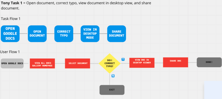
Professional Tony
Being a professional guided user, Tony’s flow is as follows: as Open Docs, open document, correct error, view in desktop and share.
Ideate
Secondary Persona
Creative Carmela
Being a creative person that needs to jot and edit, Carmelas flow is as follows: Open Docs, open chosen document, copy notes, select template and paste notes.
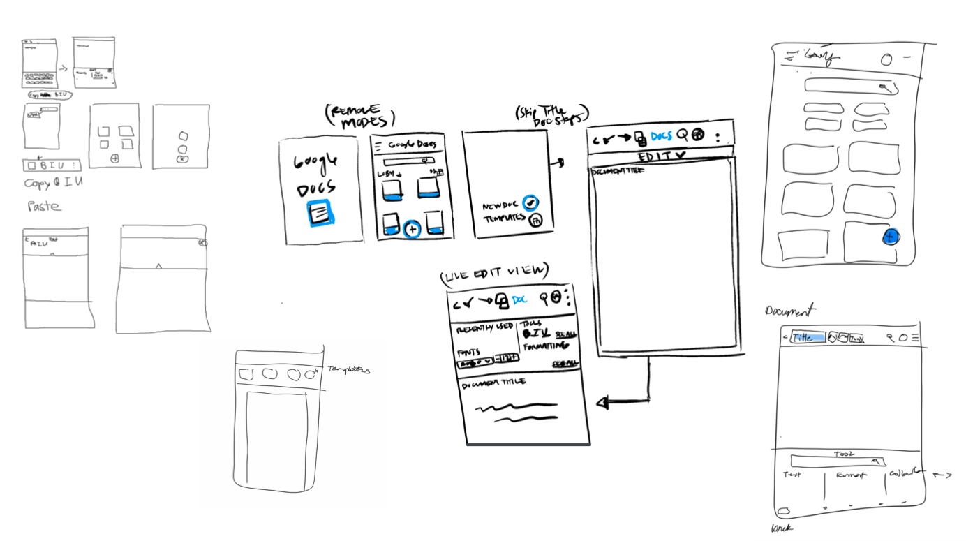
Sketching
Once we organized all our insights from the exploration phase, we began to redesign the current mobile app. To start this process, we sketched several of the app’s main screens, using the user flows and feature prioritization as a guide. This allowed us to quickly explore several concepts for the app redesign and see whether these solutions addressed both the user and business needs. We developed 3 different modes to satisfy the primary user flows: editor, reader, and quick notes as well as integrated the templates and collaboration page into a drop down carousel menu and headed on to Wireframing.
Design I
Wireframes
Key Features
3 Modes
Users now have access to an Editor, Reader, and Quick notes mode to satisfy their primary needs.
4. Quick Notes
For quick and easy on the go notes, users can quickly type notes.
6. Team Access
Through direct Team access users can see other online users, chat, revise their history, comment, and suggest edits. Owners of docs and others with privilege can lock formatting for others.
2. Editor Mode
Allows for comprehensive formatting, more functionality when using text & photos. It has more font options and a handwriting feature.
5. Templates
Templates are also available for both professional and quick lists.
3. Reader Mode
Users have ample collaboration capabilities and commenting..
3. Reader Mode
Reader mode makes the experience more familiar by mirroring the desktop version through page numbers, breaks, and whole page view
Prototype I
Once we completed the wireframes, we created the first prototype of Docs mobile app redesign to begin usability testing. This allowed us to evaluate how users would engage with the proposed app solution and validate whether it was addressing the primary user needs.
Usability Testing
Study Plan
We conducted a remote and moderated usability test using Zoom and Figma with 5 participants and asked them to complete 2 different scenarios to put themselves into the shoes of the user personas.
Scenarios and Tasks
TASK 1: You need to edit a collaborative document.
• Show me how you would go about opening collaborative Document X, bolding the word ‘sentence’ then undoing the bolding.
TASK 2: Jot down notes quickly before you forget them.
• Use our product to quickly write down your notes.
TASK 3: Review project in desktop view.
• View preview of all of the pages in Project Y.
Results
Off of our findings we considered:
WHY IS OUR SOLUTION EFFECTIVE?
• People found the preview mode icon very intuitive
• Ability to search functions
• Ability to chat
• Agreement that prototype was still more navigable than current google docs mobile
HOW CAN WE IMPROVE IT FURTHER?
• Decrease time for user to navigate app
• Have most common options available on highlight
• Improve flow
• Consolidate Modes.
Sketching II
Listening to the needs of testers after conducting the usability test on the first prototype made us regroup and conduct a second design studio to tackle their biggest concerns: Primarily scaling down from the 3 modes we proposed and consolidating the editing, note taking, and reading capabilities into 1 interface. As well as figuring out how to make the editing tools more accessible by dissolving the dropdown menu and finding a new quick access placement for the tools.
We brainstormed ways to integrate the tools, templates, and consolidating the 3 modes into 1 mode.
Possibilities we came up with were integrating the tools as part of the keyboard, maintaining a consistent UI palette, and upholding familiarity in the create button placement.
Design II
Re-focusing User Flows
After revisiting our redesign proposal, we had to refocus our user flows to reflect the needs of our testers. This meant prioritizing the chat and commenting feature, the templates feature placement, all while maintaining visibility and familiarity.
Primary Persona
Professional Tony
Being a professional guided user, Tony’s flow was refocused to be as follows: opens docs, access a case study, comments, and sends a chat message.
Ideate II
Secondary Persona
Creative Carmela
Being a creative person that needs to jot and edit, Carmelas flow was refined to be as follows: open docs, creates a new doc, uses a template to create a bullet grocery list.
Revisiting the User flows not only allowed us to focus on what each of the users needed to accomplish their goals and needs, but also how to deliver that experience in the most effective manner possible.
Hi-Fidelity
Prototype
Our Hi-fidelity Prototype culminated in a design that is familiar, mirrors the desktop experience, integrates templates, and has a defined collaborative page while allowing for quick access editing and formatting within the keyboard.
Next Steps
Moving forward we hope to:


