A UX Challenge in Designing for Counter-culture Informed Branding
Overview
For this project, I redesigned the e-commerce website for Graveyard Shift, a local streetwear shop in Oakland, CA. The redesign focused on aligning the business goal of increasing sales with user needs, creating a seamless intersection between the two. I chose Graveyard Shift due to my interest in designing for counter-culture branding. By enhancing the site's navigation and introducing more curated product lists, I helped build user trust and expanded sales opportunities.
My Role
On this solo project, I took on the roles of UX Researcher, UX Designer, Interaction Designer, Usability Tester, and Product Designer.
UX Techniques Used: Heuristics Evaluation, Competitive/Comparative Analysis, Affinity Mapping, Card Sorting, User Personas, Site Map, Task Analysis, Task Flows, User Flows, Wireframing, Prototyping, Usability Testing
Materials: Online Cards/ Optimal Cardsorting, Online Sticky Notes/ Miro, Pen, Paper, Figma
Timeline: 2 Week Sprint, Adobe X General Assembly
Deliverables
Research: User Interviews, Competitive & Comparative Analysis, Card Sorting
Synthesis: Digital Personas, Problem and Solution Statements, Task Flows, User Flows, Sitemap
Ideation: Sketches, Mid-Fidelity Wireframes
Testing: Prototype, Usability Testing
Presentation: Next Steps, Slide Deck
Challenge
Graveyard Shift, a local Oakland streetwear shop's current e-commerce experience is suffering from a lack of customer trust and decrease in sales. Their current e-commerce experience could greatly be improved.
Research
I started the design process by engaging in 5 forms of research:
Graveyard Shift Background
GS is an independently owned streetwear shop in Oakland, CA that specializes in hand printing hundreds of streetwear items: t-shirts, hoodies, beanies etc. by local Bay Area artists. Their current e-commerce experience could be greatly improved.
1. Heuristics Evaluation
To understand the issue at hand more in depth, I conducted a heuristics evaluation of the Graveyard Shift Website where I noted issues with consistency, visibility, recognition, and error prevention.
2. User Interviews
I then embarked on User Research and conducted 4 User Interviews and Task Analysis by testing the current design of GS with Usability Tests with online shoppers.
Methodology
Themes:
Emotional Experience and Needs
Motivations
Satisfaction and Frustrations
Stimuli: Access your favorite online streetwear website
Prompt: How do you go about searching for and selecting x streetwear product to buy
Interview Questions
I asked questions like:
What does streetwear mean to you?
From these questions I wanted to learn why branding is important to users and what features and qualities user's love from online streetwear stores so that I could make sure these were front and center in Graveyard Shift’s new design.
What would lead you to visit a streetwear website?
When visiting streetwear sites what do you look for?
3. Usability Test and Task Analysis
Current Site
After testing the current Graveyard Shift Site, I also asked users questions like:
How did you feel about:
Website performance
Product catalog layout
Product information
Pricing
Shipping options
Payment experience
General feel of Website
I wanted to see user's needs and priorities.
Interesting Findings: Users expressed that they spent significant time browsing the lifestyle homepage, need a clear global navigation system, utilize filters, and need an easy checkout process.
4. Competitive Analysis
Feature Inventory
To gain further inspiration for the e-commerce website re-design, I also identified 2 indirect competitors in the streetwear market: 1) Fucking Awesome and 2) Stussy. My goal was to compare and identify common features across these sites and potential opportunities for Graveyard Shift to differentiate itself.
The most important takeaway was learning how streetwear websites organize their clothing selection and the overall layouts they use for those websites.
5. Market Research
STREETWEAR IMPACT REPORT
Question:
WHAT IS THE OBSESSION WITH STREETWEAR?
Interesting Finding: The top reasons consumers reported liking streetwear are: Cool, Comfortable Clothing, Exclusivity, Community and Status Symbol.
Source: Hypebeast x Strategy& Streetwear Impact Report
Key Insights
100%
“I'm more likely to buy from engaging sites, GS doesn't show lifestyle pics at the front”
— Participant 2
80%
“The catalog is confusing; GS has no sub-sections”
— Participant 4
80%
“No search bar. I have to look for the product myself. I’m doing all the work here”
— Participant 3
100 %
“Navigating GS is hard, unreliable & sketchy”
— Participant 1
80%
“I didn't think GS had a cart; scrolling to get to it is so inconvenient”
— Participant 2
SUS Score: 55
User Needs and Recommendations
-
With all this data behind me I identified the biggest pain points of users into 5 categories with recommendations to ease their painpoints.
-
1. Trustworthy Customer Brand Relationship
-Engaging photo-filled homepage to reflect streetwear counter-culture lifestyle
-Consistency within interactive buttons on website
-
2. Clear Product Organization
-One global navigation system
-Rephrasing categories
-Incorporation of drop-down menu with clear subcategories that integrate and reflect proper products
-
3. Legible Product Layout
-Detailed product information to ensure proper product selection
-Hover over product description before clicking on product
-Thought-out product placement: sold out not prioritized
-
4. Quick Search Access
-Filters by Color and Size
-Clear and accessible search engine
-
5. Efficient Checkout Process
-Remember last placement on product search
-Visible cart
-Drop-down menu for product specifications before adding to cart
-Add to cart feedback
-Payment alternatives aside from filling out info Source
Define
Affinity Map
After these interview questions and test, through affinity mapping I was able to validate the heuristics evaluation observations and categorize clusters of main pain points and needs that were consistent with the interviewers. This discovery culminated in an affinity map.
Customer Personas
From the data I collected from these 4 users, I created 2 personas to address the current state of the GS website.
Persona A
Their Problem Statement: quick access to visible filters with a wide selection of color and size as well as the option to also search via a search engine feature because he feels overwhelmed and swayed from purchasing when there are many items to browse through. .
Persona B
Their Problem Statement: the need for access to a global navigation system and concise subcategories that include and reflect the proper products within because cluttered website layouts make it hard for her to browse through all the products.

Solution
Graveyard Shift is an online streetwear store for streetwear enthusiasts to browse, filter, and buy cool, unique products that aim to uphold an effortless, self-expressive, counterculture lifestyle.
Card Sort
OPEN
I asked 15 participants to organize the 111 products into categories that seemed the most logical to them. Then I had them label each of those groups with titles they felt accurately described the items in that category. The goal of this was to gain an understanding of the potential ways the products on the GS website could be categorized and how those categories could be labeled.
Ideate
Site Map
With the results of the card sorting, inspiration from other competitor streetwear websites. and synthesizing the data from the user interviews & task analysis, I created a site map to define the overall structure of the website. This was to ensure that products were going to be placed where users would expect to find them when visiting the website and make the experience more intuitive.
Sketching
Once I organized all my insights from the exploration phase, I began sketching ideas tackling users needs to design the website. To start this process, I sketched several of the site’s main screens, using my user flows as a guide. This allowed me to quickly explore several concepts for the website layout and see whether these solutions addressed both the user and business needs.
Wireframes
MID-FIDELITY
Prototype
MID-FIDELITY
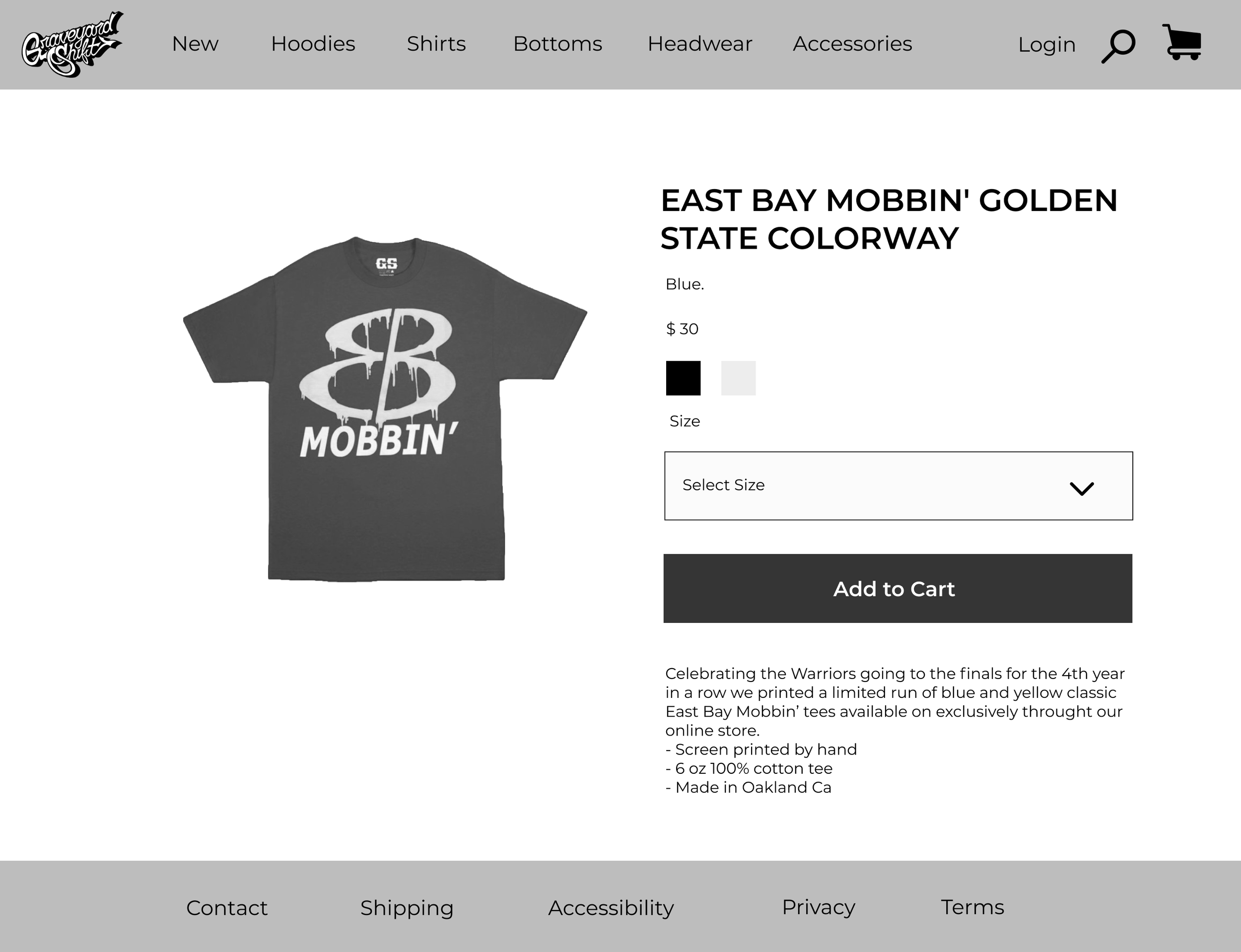
Once I completed the wireframes, I created a
Prototype of the website redesign to begin usability testing. This allowed me to evaluate how users would engage with the proposed website solution and validate whether it was addressing the primary user needs. It was important to test with mid-fidelity, grayscale wireframes to gather honest, critical feedback from potential customers and to solidify the functionality of the website before addressing the visual design.
Usability Testing
Study Plan
METHODOLOGY
I conducted a usability test with 4 participants and asked them to complete 2 different scenarios and put themselves in the shoes of the user personas.
OBJECTIVE
Test the overall performance of the new proposed site.
SCENARIOS AND TASKS
Your friend recommends this new streetwear website.
Task: Show me how you go about purchasing an item for yourself.
2. You have an item in mind that you are looking to find.
Task: Show me how you would search for an item.
Moodboard
I crafted a mood board of GS lifestyle using photos from their own website to get a true feel of what it's like to wear these products while showcasing the great drivers of SW consumption: sense of community, exclusivity, status, & branding.
Branding
Style guide
I also created a Design system for Graveyard Shift using their own colors while making some adjustments. I focused on thinking about the current UI and incorporating a more aligned typography reflective of the city landscape.
Next Steps
Moving forward I hope to:
Finish Hi-fidelity Mockups
2. Conduct customer testing with Hi-fi prototype
3. Think about collaborative product development feasibility


